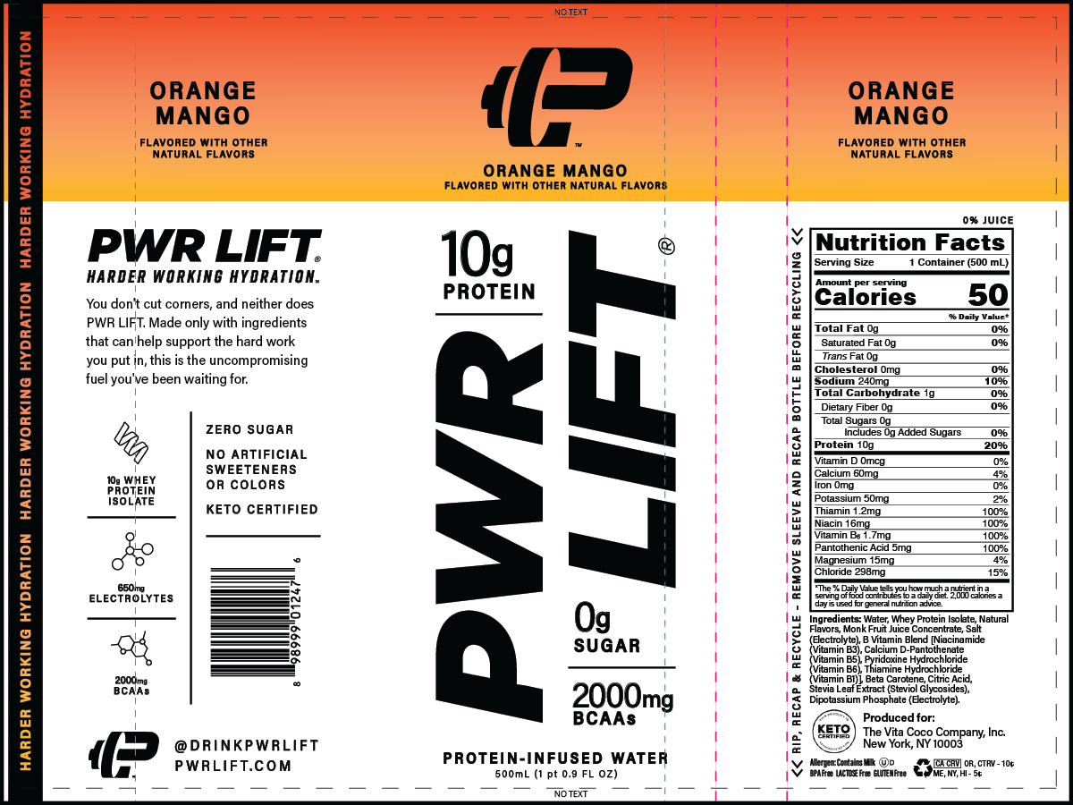
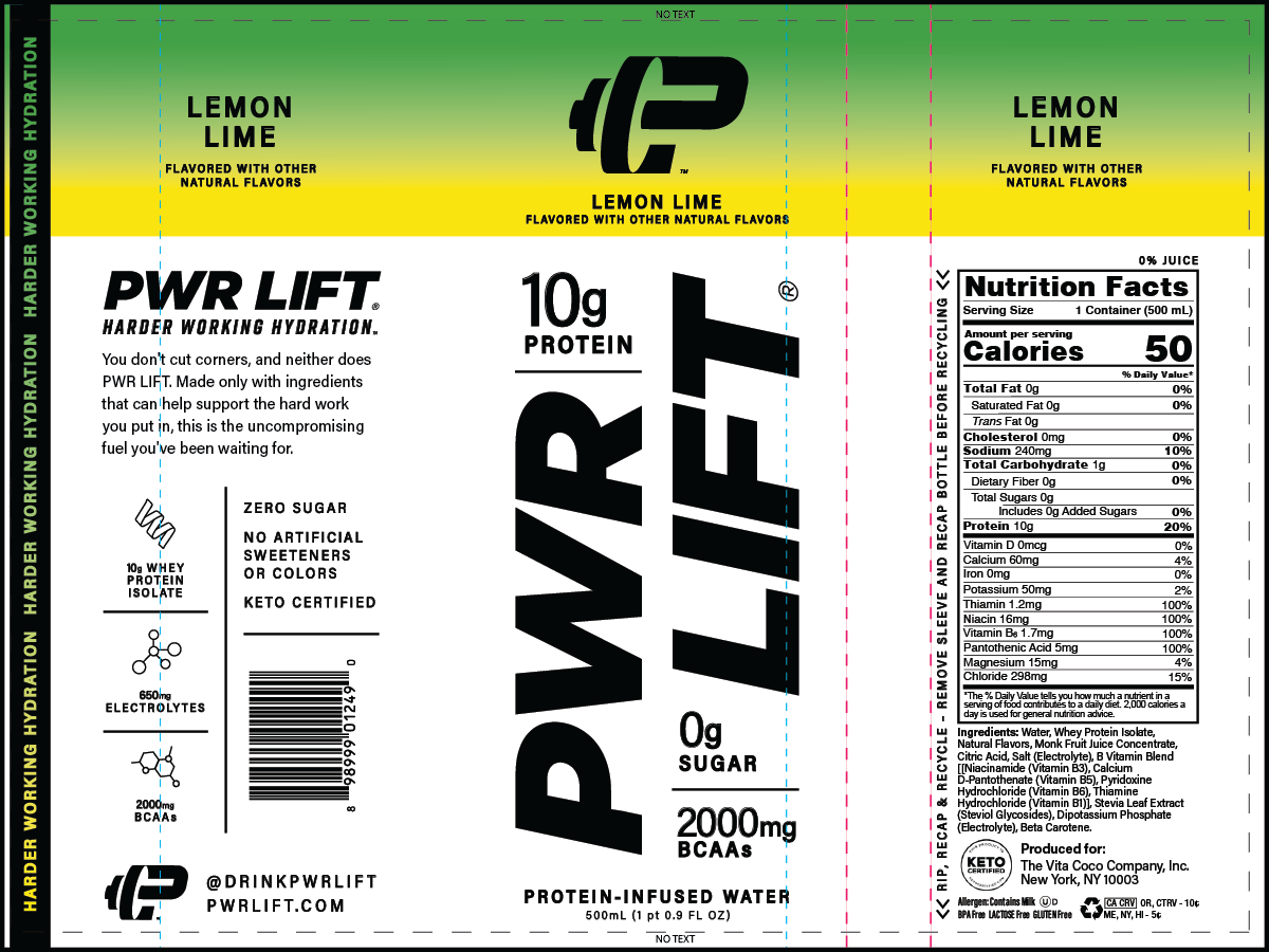
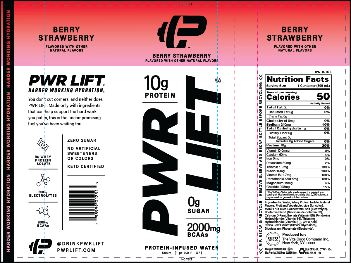
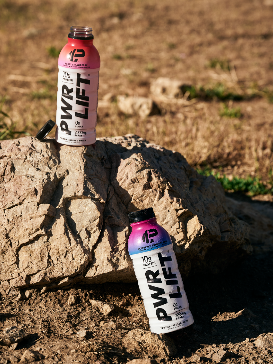
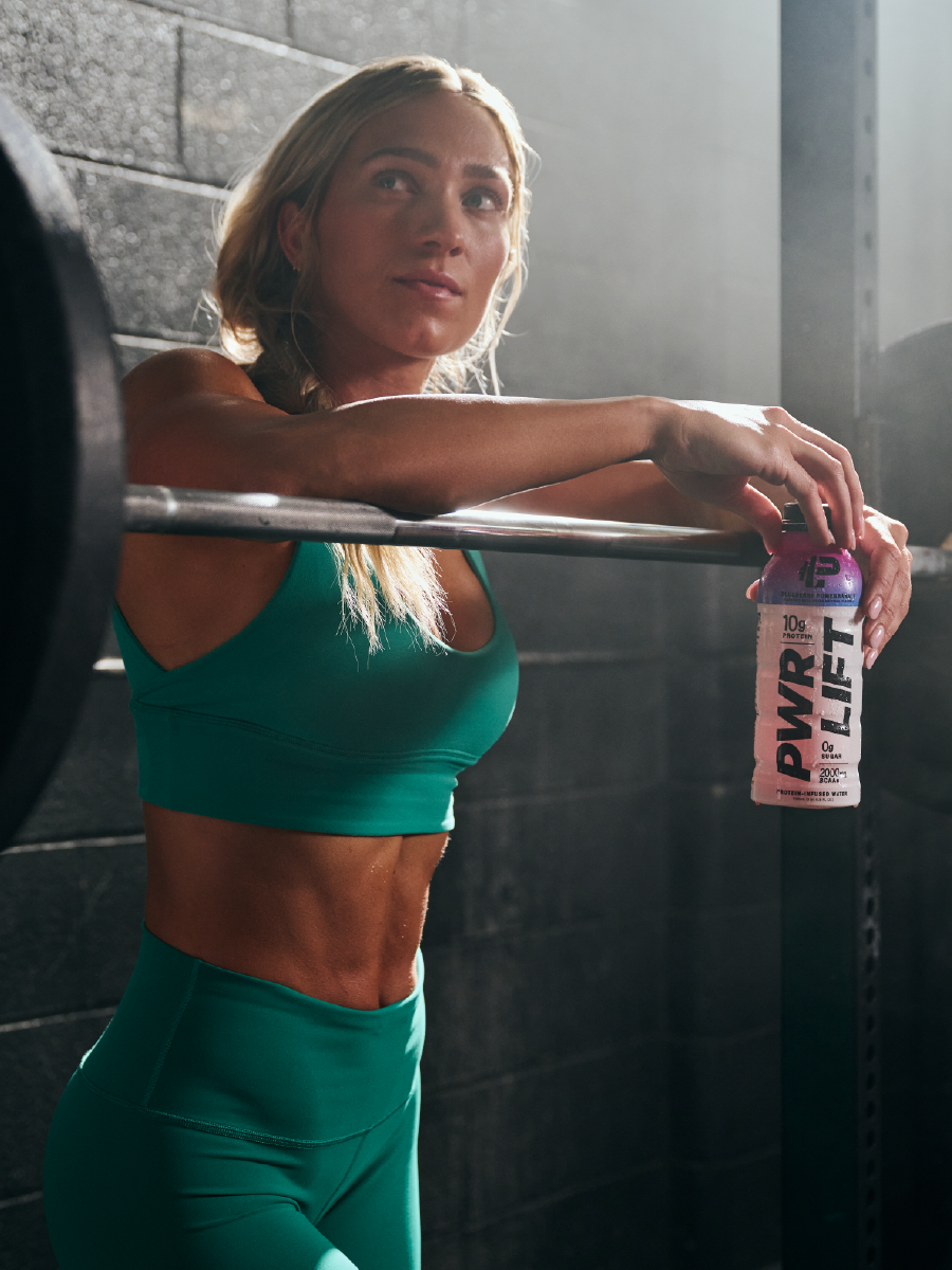
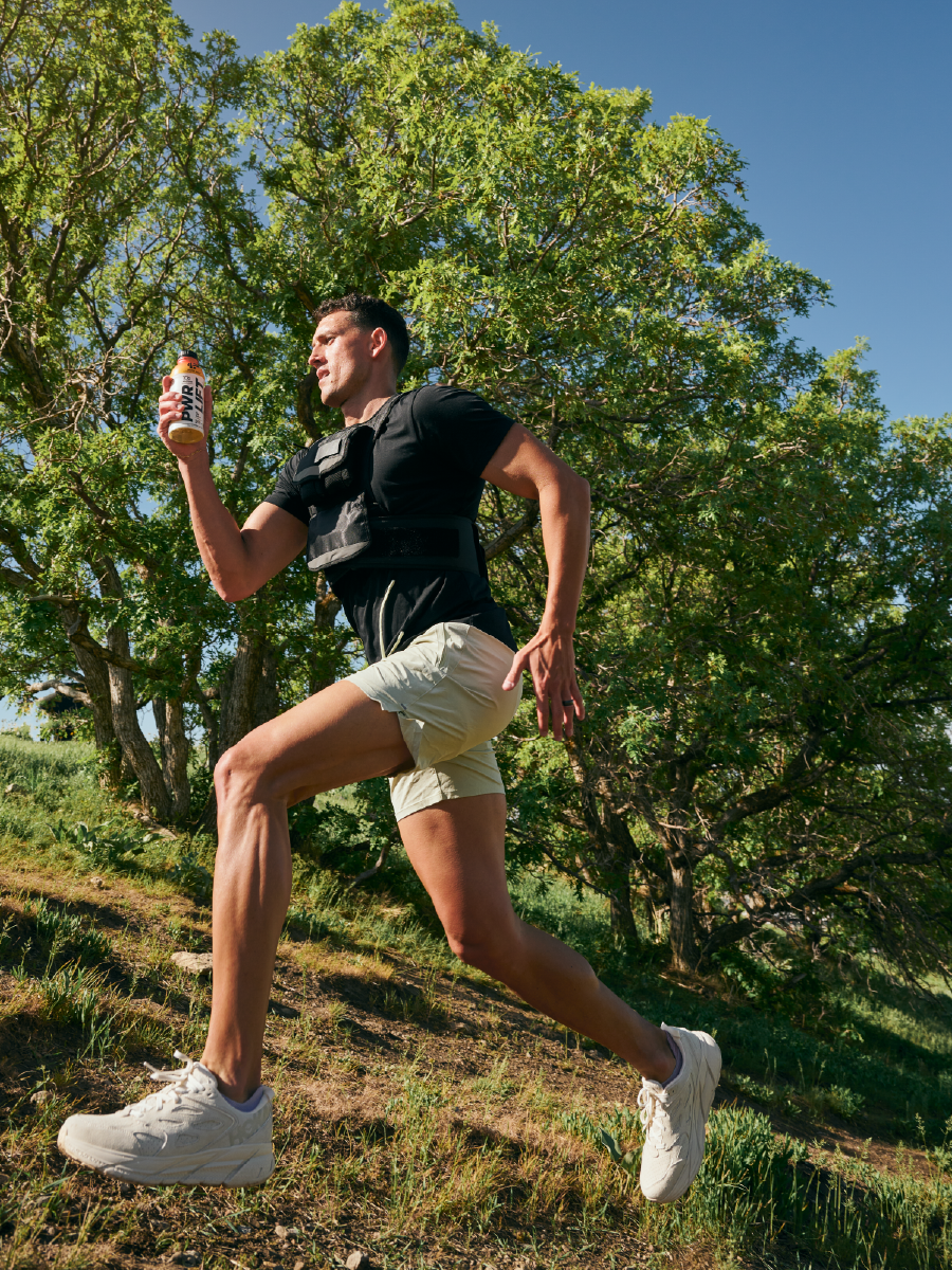
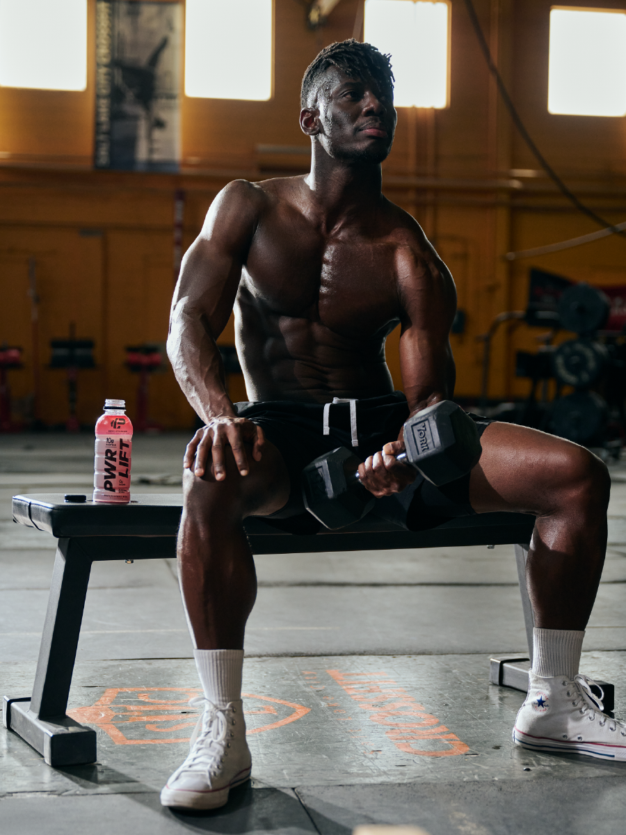
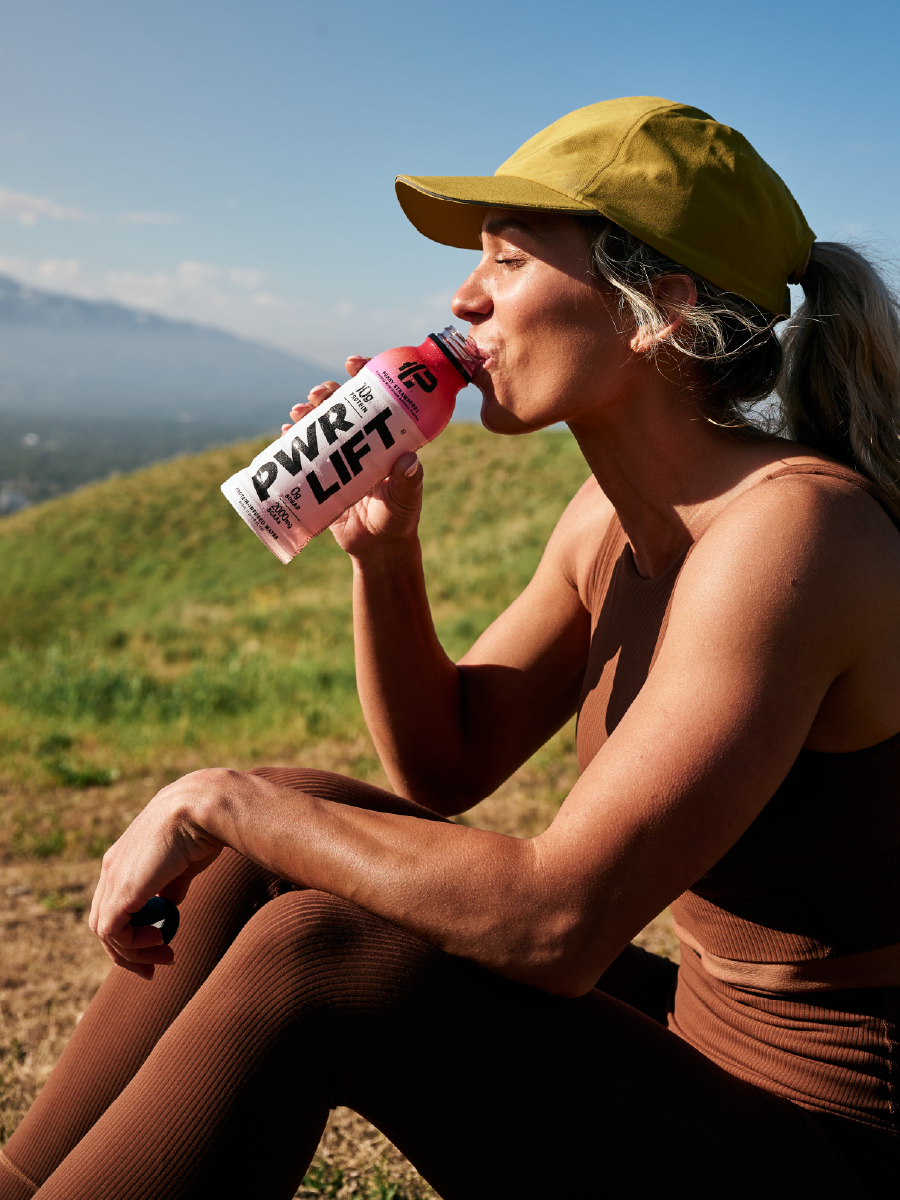
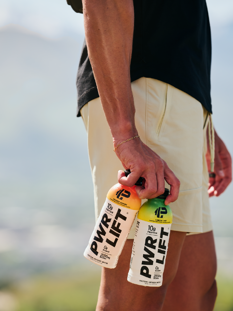
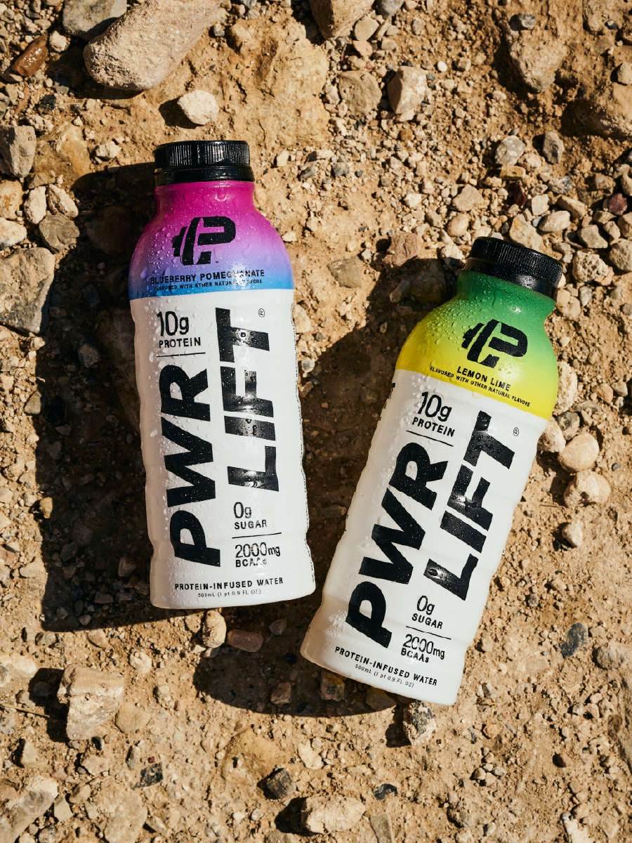
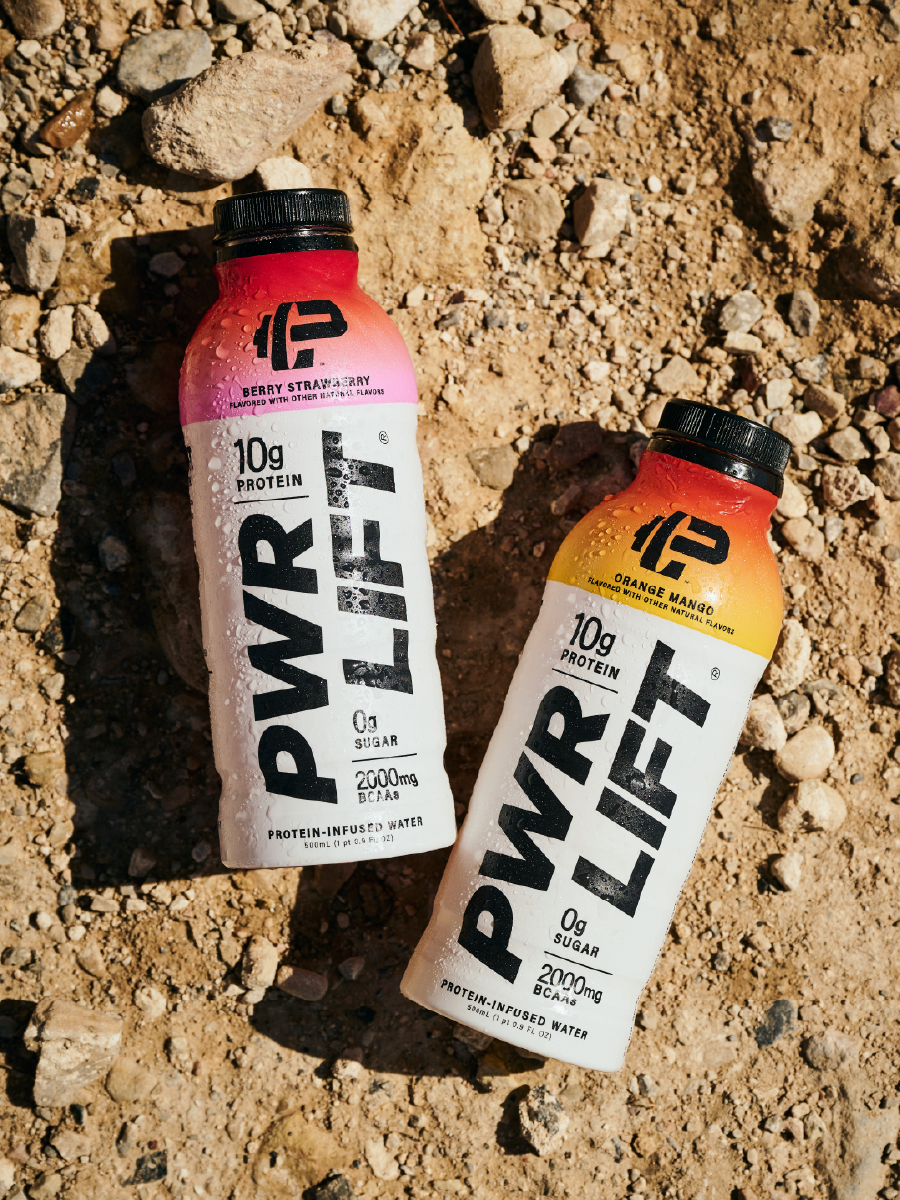
PWR LIFTWhat you put into your body matters. That’s why we took no shortcuts creating a protein-infused water with all the functionality you need and none of the artificial flavors, sweeteners, or colors that existing brands may use. And with four delicious, fruit-forward flavors, you can feel good about how you choose to fuel.
PWR LIFT is for people who care about what they put into their bodies. The visual identity is confident and bold, reflecting the premium quality of the product, and clean, uncomplicated ingredients.

-

Wordmark Logo
The current wordmark captures the energy and intensity of our brand. For any design application that is not packaging, such as marketing materials or the web, we use the horizontal wordmark.
-

"PWR BELL" Logo
The PWR LIFT logo, called the PWR BELL, is the official PWR LIFT symbol, which combines the force of a dumbbell with a strong capital P, personifying weightlifting.
-

Logo Lockup with Tagline
Our tagline PROTEIN-INFUSED WATER can be added to the wordmark to communicate our value proposition while signifying we are a protein water brand.The tagline can be used centered under the PWR LIFT wordmark or left-aligned.